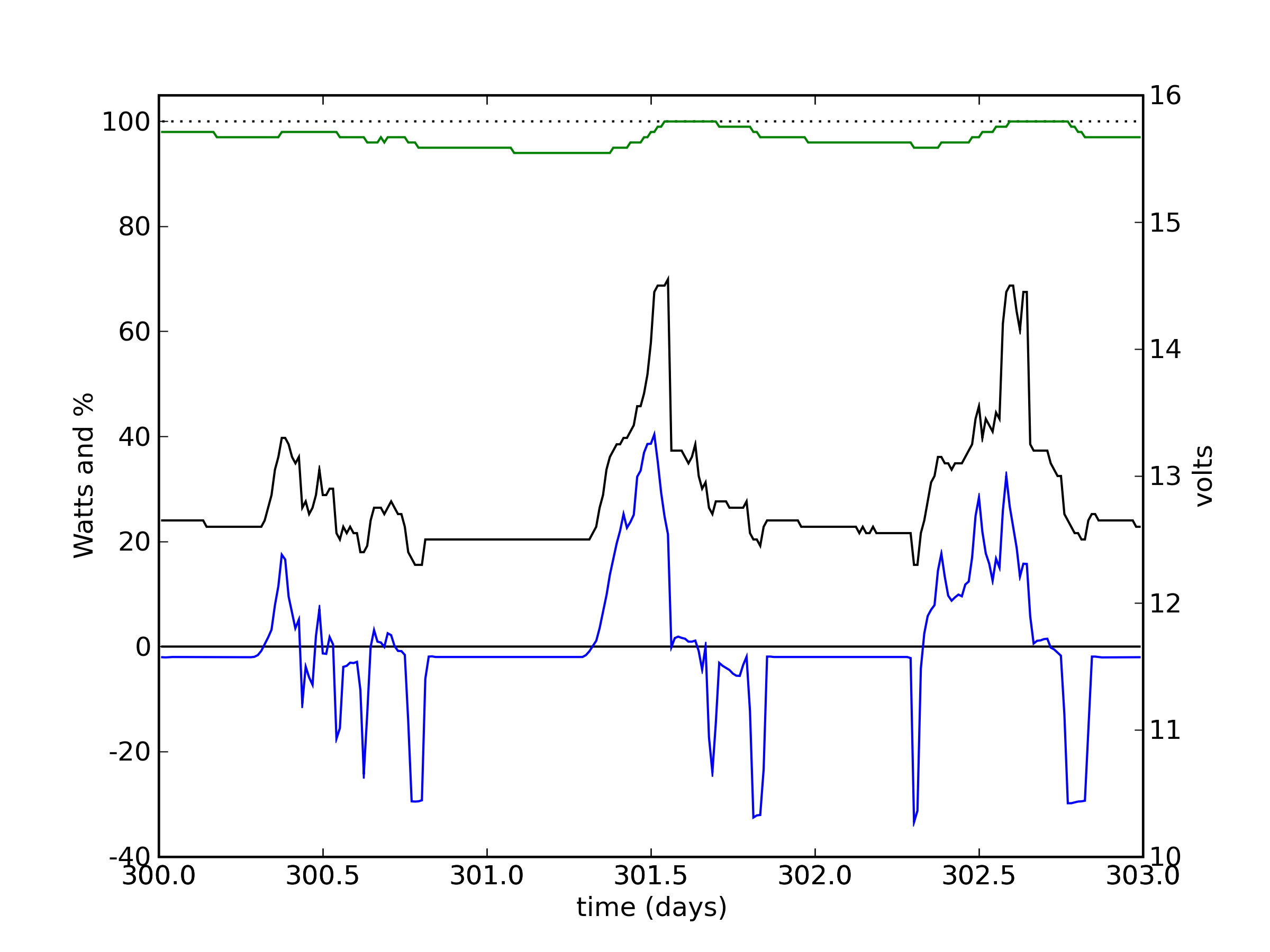
System #2 PV Time Series
Time series for PV system #2, for the same time period as the previous system #1 plot. Much of the plot information is the same: The green line is battery % full, and the black line is battery voltage (scale on right). This time, however, only the net battery current is measured, so that the blue line is a composite of solar input and load usage. Since this system primarily runs lights in the living room, these two activities are mostly exclusive.
The off-state for this system is much less taxing than the 6–8 W of the entertainment system, amounting to about 2 W, and attributable to the idle power consumption of the 400 W inverter. The two fluorescent torch lights run by this system have illumination settings of 30, 35, and 65 W. Most commonly, we use one light at a time on the lowest setting (seen here as frequent negative dips to −30 W).
For direct comparison, here are the two systems together.
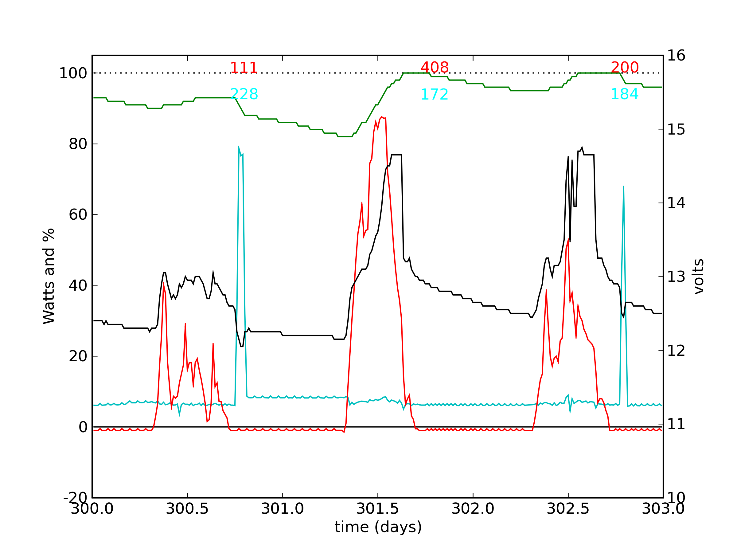
System #1 (entertainment) is on top, and system #2 (mostly lighting) is at
bottom. Note that common solar illumination features can be seen in both,
including the small dip on the upslope of the middle (mostly sunny) day.
It can also be seen that the lights were generally on during periods of
TV-watching, and that the night following the middle (sunny) day had no
TV-watching, but the living room was used for other purposes (reading?).
The negative net battery for system #2 during the day on day 300 is likely
due to intermittent use of a laptop computer plugged into the solar source.
Previous Data Set | Next Data Set